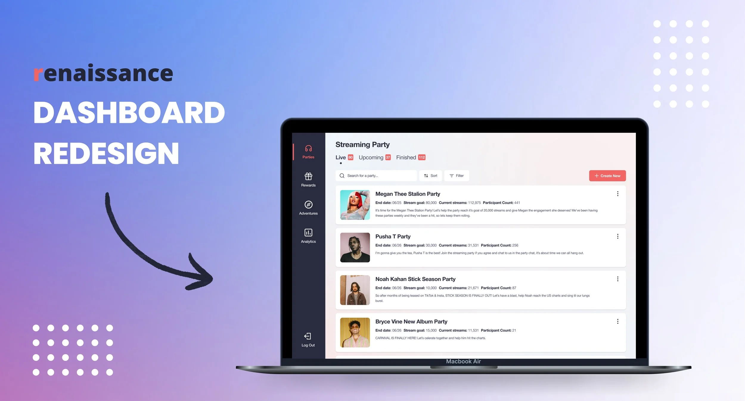
Renaissance is a social audio app, used by over 300,000 music lovers and artist super-fans worldwide. As the app grows, so does the responsibilities of the team and so having a user-friendly, functional admin panel is crucial.
For this project, my task was to redesign the admin panel, to improve the usability, layout and UI. I also focused heavily on identifying and implementing new features needed by the team.
Duration: 4 months Role: Sole UX/UI Designer
The Original Design
The original dashboard connected to the Renaissance app and allowed the team to view and create streaming parties, rewards and daily adventures. There was also a placeholder analytics tab, which did not yet display any information.
Streaming party tab (Live parties)
Rewards tab (create reward)
The Problem
Due to this being a large, complex redesign, it was important to conduct a range of research. First, I created a research plan that outlined the timeframe for the heuristic evaluation, interviews and competitive analysis that followed.
Heuristic evaluation
Before speaking to users, I wanted to identify specific issues and usability problems. To do this, I conducted a heuristic evaluation using Jakob Nielsen’s 10 General Principles for Interaction Design to guide me. Below is a snippet of the evaluation:
The evaluation helped me identify a lot of usability issues with the admin panel. Examples include, inconsistencies around wording and placement of buttons and the inability to see how something would look in app until it’s been created. By rating these issues by severity, I was able to consider how much they were affecting the overall usability.
Interviews
The findings from the heuristic evaluation then helped shape the interview questions that were asked by a team member. Overall, 4 interviews were conducted with members of the team that used the dashboard the most.
Here are some key findings:
From both the heuristic evaluation and interviews, I was able to identify user pain points. Before jumping straight into ideation, I first conducted a competitive analysis to see what solutions other businesses had implemented. This was incredibly insightful, however due to the nature of this being an internal product, it was hard to get access to other admin panels. As a solution, I looked further afield to music dashboards and other target user groups, such as music artists.
Wireframes
Now that I had a solid understanding of the the problem and alternative solutions, I felt ready to come up with solutions of my own. I used a mixture of methods during the ideation phase including; creating user flows for some main tasks and crazy 8's when sketching out ideas before creating mid-fi versions in Figma.
Below is an example of how some of the main pages looked at lo-fi and then mid-fi:
After creating all the screens in Figma, it was then time to create a prototype that could be tested through usability interviews.
Testing the flow
To make sure the new design worked as intended, I conducted 4 usability tests with team members who use the admin panel. This helped me discover what worked and what may need changing.
I tailored the interviews to the team members’ day-to-day tasks in the admin panel, to get specific feedback from those that are going to use it.
Below you can see some notes taken in Miro from the interviews:
Making small changes
For the most part, users did not struggle with the tasks they were presented with. This was great news, however it’s important to note the users are already familiar with the initial admin panel and therefore were not first-time users.
One small change I did make was to modal pop-ups. Originally a pop-up could be closed by clicking off the modal, however when asked to edit a party, some users did this instead of clicking save. Users found this frustrating as they had to go through the process again to click save. To improve the user experience, I added a cancel button and removed the ability to click outside of a modal to exit.
UI Redesign
Now that the admin panel has been validated with users and the new functionality had been added, it was time to focus on the UI redesign. After creating a mood board and looking at other Web Apps, I considered accessibility using WCAG, WebAIM colour contrast checker and made sure text styles were a minimum of 12 px.
I came up with 3 UI options, with differences such as side bar size, background and modal colors.
To prevent bias and to involve the team, I created a preference test. I asked a series of questions around which design they preferred, their preferences on smaller UI considerations, like side navigation bar size, and why they had those preferences.
Key findings from the test
The Final Delivery
With a full redesign of the admin panel, I was able to save the team time on important tasks and create a cleaner and more modern Renaissance product. After completing the designs and getting them approved by the team, I handed it off to the engineers so that they could start to build.


